
A building-services engineer is comparing energy use across three offices. One report gives kilowatt-hours per month, another gives kilowatt-hours per square metre, and a third includes a much larger building with longer operating hours. The raw totals appear to identify a clear winner—until the comparison is made fair.
A manufacturing team faces a similar problem. One production line made 20,000 parts, another made 5,000, and both recorded defects. Comparing defect counts alone says more about volume than quality. Comparing rates tells a different story.
Engineering is full of measurements collected in different units, scales, conditions, and time periods. A number is not automatically comparable just because it is numerical.
Normalization transforms measurements into a common, meaningful basis so engineers can compare patterns rather than incidental differences. It is a mathematical step, but it is also a discipline of asking: compared with what?
📏 What normalization means in engineering
Normalization is the process of rescaling, converting, or adjusting data so values can be compared sensibly. The appropriate method depends on the question, the physical meaning of the measurement, and the decisions that will follow.
It may mean converting units, dividing by a relevant exposure such as time or area, expressing a value relative to a reference, or mapping several variables onto a shared numerical scale. These are related operations, but they are not interchangeable.
🔎 The problem with raw measurements
Raw data contains both the effect engineers want to study and the context in which it was observed. A pump that consumes more power may be moving much more fluid. A bridge that deflects more may also span a longer distance.
If context is ignored, a raw comparison can reward small systems, short test periods, or low workloads rather than efficient or reliable designs.
⚖️ Comparability is the real goal
Normalization is not performed merely to make a spreadsheet look tidy. Its purpose is to create a comparison that answers a defined question fairly.
For example, “Which site uses the least electricity?” and “Which site uses electricity most efficiently?” are different questions. The first can use total energy; the second usually needs a basis such as floor area, production output, occupancy, or operating time.
🔄 Unit conversion comes first
Measurements must share compatible units before any deeper comparison. A force recorded in newtons cannot be directly added to or compared numerically with a force recorded in pounds-force without conversion.
Unit conversion preserves physical meaning. If temperature is central to the analysis, engineers must also recognize that Celsius and Fahrenheit have arbitrary zero points, while kelvin is an absolute temperature scale. The choice affects which mathematical operations make sense.
🧮 Dimensional analysis prevents nonsense
Dimensional analysis checks whether an equation or ratio has coherent physical units. Dividing distance by time produces speed; dividing energy by time produces power.
This simple check catches many normalization errors. “Kilograms per second” may be a useful mass flow rate, but dividing kilograms by volts without a physical model is not automatically informative. A ratio needs an engineering interpretation, not just two available columns.
🏭 Normalize by the relevant exposure
Many engineering quantities should be related to the opportunity for an event to occur. Defects can be divided by units produced, failures by operating hours, incidents by distance travelled, and emissions by useful output.
The denominator is called an exposure variable. It represents the scale of operation that makes the numerator interpretable. Choosing it well is often the most important part of the analysis.
⏱️ Rates reveal time-dependent behaviour
Suppose two machines experience six stoppages. If one ran for 60 hours and the other for 600 hours, their reliability is not equivalent. Stoppages per operating hour gives a more useful first comparison.
Rates are especially valuable when test durations differ. They do not explain every cause of failure, but they prevent duration alone from dominating the result.
📦 Per-unit metrics separate scale from performance
A factory producing more components will normally use more material and generate more scrap in total. Material use per part and scrap mass per part help distinguish production scale from process efficiency.
Per-unit measures also support planning. If a process requires 1.8 kilograms of material per finished unit, the figure can be combined with an expected production volume to estimate supply needs.
🏢 Area, volume, and capacity matter
Buildings, tanks, warehouses, and transport systems have different physical sizes. Energy per square metre, heat loss per square metre of envelope, storage cost per cubic metre, and flow per unit capacity can be more revealing than totals.
Still, the chosen size measure must fit the mechanism. Floor area may be suitable for comparing office lighting energy, while conditioned volume may better describe heating demand in spaces with very different ceiling heights.
🌡️ Environmental conditions can distort comparisons
Outdoor temperature, humidity, wind, soil condition, altitude, and incoming solar radiation can change engineering performance. A cooling plant working through a hot summer cannot be fairly judged against identical equipment in milder weather using raw energy alone.
Engineers may adjust data using weather variables, test corrections, or carefully matched operating windows. The aim is not to erase real conditions, but to separate them from the equipment effect being investigated.
🎯 Reference-based normalization
A measurement can be expressed relative to a reference value. If a component’s vibration amplitude is divided by its allowable limit, the result becomes a dimensionless utilization ratio.
A value below 1 indicates it is below that chosen limit; a value above 1 indicates it exceeds it. This form is useful because quantities with different original units can be discussed on the same “fraction of reference” basis.
📊 Percentage change needs a sensible baseline
Percentage change is a familiar reference-based normalization: (new − old) / old × 100%. It communicates proportional movement, not absolute size.
A reduction from 2 to 1 is a 50% decrease, while a reduction from 200 to 199 is only 0.5%, despite both changing by one unit. Percentages are helpful when the baseline is meaningful and clearly stated.
🗺️ Min-max scaling creates a common range
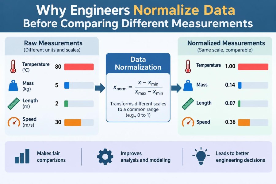
Min-max scaling maps data to a chosen interval, often 0 to 1. For a value x, the scaled result is (x − minimum) / (maximum − minimum).
This is useful when combining variables in a score or displaying variables with very different ranges. However, the minimum and maximum are data-dependent, so new observations can change the scale.
📐 Standardization measures distance from typical
Standardization, often called z-score scaling, subtracts the mean and divides by the standard deviation: z = (x − mean) / standard deviation. The result indicates how far a value lies from the dataset’s average in units of typical spread.
This helps compare variables such as pressure and temperature when looking for unusual observations. It does not turn one physical quantity into another; it compares their relative positions within their own distributions.
📈 When standardization is useful
Standardization is commonly useful in multivariable analysis, pattern detection, and models sensitive to numerical scale. Without it, a variable measured in thousands may dominate a calculation simply because its numbers are larger.
It works best when the mean and spread are meaningful summaries. Strongly skewed data or data with extreme outliers may need a different method.
⚠️ Outliers can reshape the scale
An outlier is an unusually large or small observation. In min-max scaling, one extreme value can compress nearly every other value into a narrow part of the 0-to-1 range.
In standardization, outliers can pull the mean and inflate the standard deviation. Engineers should investigate unusual data rather than automatically delete it: it may reveal a sensor fault, a changed operating condition, or a genuine failure event.
🧱 Ratios are powerful but not always safe
Ratios appear everywhere: stress per area, fuel per distance, cost per unit, and defects per batch. They are useful only when the denominator is stable, relevant, and not close to zero.
Dividing by a very small number can create dramatic values from small measurement noise. A “cost per unit” metric is also misleading if a batch produced almost no acceptable units. Report the denominator alongside the ratio when stakes are high.
🔋 A practical energy comparison
Consider two hypothetical data centres. Site A uses 900 MWh in a month and Site B uses 1,100 MWh. Raw totals suggest Site A performs better.
But if Site A delivered 18,000 compute-service units and Site B delivered 30,000, their energy intensities are 0.05 and about 0.037 MWh per unit, respectively. Site B used more energy overall while using less energy for each unit of useful service.
🚗 A transport example
A fleet manager comparing maintenance costs should not compare monthly invoices alone. A vehicle travelling twice as far has more exposure to wear.
Cost per kilometre, failures per 10,000 kilometres, and fuel per 100 kilometres create fairer comparisons. Yet route grade, payload, traffic, and driver operating patterns may still need to be considered before assigning causes.
🧪 Laboratory measurements need controlled bases
Experimental results are comparable only when test conditions are compatible or explicitly corrected. Material strength may vary with specimen geometry, loading rate, temperature, moisture, and preparation method.
Standard test methods often specify these conditions because normalization cannot repair every inconsistency after testing. Good experimental design reduces the amount of adjustment required later.
🤖 Why algorithms care about scale
Many optimization and machine-learning methods use distances, gradients, or weighted combinations. If one input ranges from 0 to 100,000 while another ranges from 0 to 1, the larger-scale input may dominate calculations for numerical rather than physical reasons.
Scaling inputs can improve numerical conditioning and make model training more stable. It does not guarantee that the model is valid, unbiased, or physically sensible; input selection and validation still matter.
🧠 Normalization does not create causation
After normalization, a difference may remain between two systems. That does not automatically identify its cause. Lower energy per unit could reflect better equipment, but it could also reflect a different product mix, quality requirement, operating schedule, or measurement boundary.
Normalization supports fair description. Causal conclusions require engineering knowledge, controlled comparison, or an analysis designed to address competing explanations.
🧾 Define the measurement boundary
Before calculating a normalized metric, define what is included. Does energy use include auxiliary pumps? Does production output include rejected parts? Does maintenance cost include labour, spares, and contractor work?
Different boundaries can produce different answers from the same physical system. A metric is only auditable when its numerator, denominator, time period, units, and inclusions are documented.
🧩 Avoid mixing incompatible populations
A single benchmark may conceal important differences. Comparing hospitals, warehouses, laboratories, and offices on energy per square metre can be useful at a broad level, but their service demands differ substantially.
Likewise, comparing defect rates across products with different tolerances may be unfair. Group similar operating contexts first, then normalize within those groups where possible.
🧭 Choose the metric before seeing the result
Selecting a denominator after inspecting the data can unintentionally favour a preferred conclusion. Define the question and comparison basis in advance whenever the analysis will guide investment, safety, or performance decisions.
A useful planning sequence is:
- State the decision the comparison must support.
- Identify the physical output, exposure, or reference that makes the result meaningful.
- Check units, boundaries, and data quality.
- Calculate the metric and inspect the raw data alongside it.
- Record limitations and important operating differences.
🧰 Keep raw and normalized values together
Normalized metrics should supplement, not replace, raw measurements. Total annual energy still matters for budgeting and grid capacity, even if energy per unit is the better efficiency measure.
Showing both views helps readers detect trade-offs. A system can improve its intensity while increasing its total impact because activity grew; both facts may matter.
🛑 Common normalization mistakes
- Using an arbitrary denominator: dividing by a convenient number that has no link to the mechanism.
- Ignoring zero or near-zero values: creating unstable or undefined ratios.
- Comparing different boundaries: treating incomplete and complete measurements as equivalent.
- Hiding units: making a metric difficult to interpret or reproduce.
- Assuming one metric settles the issue: overlooking quality, safety, reliability, and operating context.
🗣️ Communicate normalized data clearly
Label axes and tables with units and denominators. Write “kWh per square metre per year,” not merely “efficiency index,” unless the index is fully defined.
Explain the reference period and any corrections in plain language. A concise note such as “adjusted for operating hours” can prevent a chart from being interpreted as a raw comparison.
✅ A final decision check
Before acting on a comparison, ask whether the metric reflects the decision. For procurement, life-cycle cost per required service may be appropriate. For reliability planning, failures per operating hour may be better. For environmental reporting, both total emissions and emissions intensity may be needed.
The best normalized measure is not the most sophisticated formula. It is the one whose numerator and denominator faithfully represent the engineering question.
🏁 The core principle behind fair comparison
Engineers normalize data because measurements carry scale, conditions, units, and boundaries with them. Removing or accounting for the irrelevant parts of that context allows the relevant performance signal to become visible.
Normalization is therefore not a trick for making numbers agree. It is a transparent method for comparing like with like—or for honestly showing when two things are not alike enough to compare.
When measurements are put on a meaningful common basis, engineering decisions can reflect performance rather than mere size, duration, or circumstance. That is the value of normalization: clearer evidence, clearer communication, and better questions. 📐📊